
Introduction
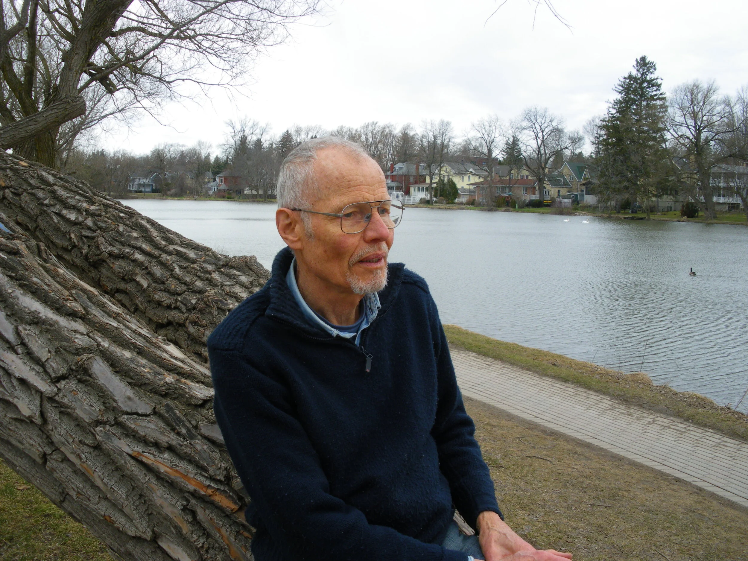
Gerard Brender à Brandis beside the Avon River in Stratford.
I came to Canada in 1947 with my parents and siblings and lived first in Terrace, British Columbia. My teacher in the third and fourth grades was Mr. Wilson, who got his students repairing the textbooks which had been overused during the Great Depression and World War II and, in the process, taught us very basic bookbinding during cold winter noon hours.
After nine years the family moved south where my sister Marianne and both our parents studied at the University of British Columbia. Then on we went to Antigonish, Nova Scotia, for a year and then we settled in Ontario. I took a B.A. in Fine Arts History which included quite a lot of studio hours. During my third year my mother and I started taking art lessons from Norma Waters in Hamilton and the following year we had our first exhibition in Burlington.
In 1964 I was introduced to wood engraving by my professor, George Wallace, and within an hour of completing my first block I announced, "I am going to be a wood engraver." My history professor, William Kilbourn, arranged a meeting with his sister Rosemary who was then one of the very few established wood engravers in Canada, and she agreed to become my mentor, a relationship that developed into a lasting friendship.
In 1965 the family moved to Carlisle, Ontario, where I lived until my move to Stratford in 1991. I immediately opened my house and studio to the public for six months a year with a display and sales area. The public was also welcomed into my studio so that I could show them how I made books. By this time I had added other book arts to my repertory, typesetting, printing on a hand press, spinning and weaving flax into linen book covers, and papermaking. In addition to my handmade letterpress editions of books I worked on trade editions, mostly with The Porcupine's Quill, frequently collaborating with my sister Marianne.
I closed my "shop in the house" in September 2019 but continue my wood engraving and book arts in my heritage house in Stratford. For a tour of my studio, click here.
Drawing

Gerard Brender à Brandis sketching at Lake Victoria in Stratford.
The first stage of every image I create is always a sketch, or, if more elaborate, a drawing. It is almost always done from life (I have no camera) as has been the case for the engravings in a book about the flowers mentioned by Shakespeare, for which I traveled to England, or my other books including those of scenes of Cape Cod, Newfoundland, or other parts of Canada. Often the inspiration is from plants in my own back yard. On a shelf in my bedroom I have a row of sketchbooks, most of which also contain journal entries, and they form a reference library from which I can work even if the contents were done many years ago.
The second stage is to choose a block of extremely close-grained endgrain boxwood of suitable size and proportions and to draw its outline onto a piece of tracing paper. I re-draw the sketch or combine parts of different sketches, enlarging or reducing their size and making many other changes. Tracing paper allows for many erasures and they are the rule rather than the exception as this is when the image is at its most fluid stage. At this point I frequently take the block to a mirror to see if I like its mirror image. This is how the design will appear in the final printed engraving. When I am satisfied I turn over the paper to reverse the design and, looking at the back of the drawing, re-draw it in pencil onto the extremely smooth surface of the block with very few if any alterations. I next go over the drawing on the block with a very fine felt pen. It is at this stage that I shade in the areas which will be black or very dark and indicate other tones with parallel hatchings.
I often leave the block where I can see it frequently, never leaving it where the sun could reach it as the heat of the sun could easily cause the block to crack. This delay is useful as it helps to establish the image firmly in my mind, though having drawn it four times already this may not be necessary. But internalizing the image thoroughly is essential to my being able to engrave with confidence – any lines that are engraved hesitantly always show an uncertain and unconvincing character. These successive drawings have also given me the chance to let my own tastes and thoughts seep into the image. The drawing process is when I perform the dialogue with the image that makes it something truly "mine".
Paper-Making

Gerard Brender à Brandis with visitors and the home-made papermaking vat.
Paper is one of the essentials for the printmaker/bookwright, and there are thousands of different kinds. Each wood engraver has a personal preference. When I began engraving and had no press, I would hand-burnish my prints onto a dry polished Japanese tissue. My first few editions of books were printed on dry, smooth, machine-made paper that certainly contained some sulphite (wood fibre) pulp. I started to learn that the presence of sulphur gradually became an acid that then destroyed the fibre. It was only during my first trip to England that I was introduced to handmade rag paper, which would not work for hand burnishing but that, by being slightly damp, was ideal for printing with a press. Having bought my press I then went to Hayle Mill in Maidstone, Kent, watched the papermakers at work, and bought paper. I became instantly enthralled. I was able to buy a small book that gave adequate instructions about making paper at home and made a brave start. Not long afterwards, Sheridan College did a weekend workshop on hand papermaking, for which Helmuth Becker brought Douglass Howells from the United States to teach.
I spent two months in 1977 touring nine countries in western Europe to visit places where paper was still being made with the old methods and equipment in the original sites, some dating back to the 1300s, such as the Moulin Richard de Bas in southern France. My education in papermaking was greatly expanded. As a result of that trip, I was invited by Sheridan College to set up a classroom for papermaking and to teach a course that was part of the book restoration programme. I was able to use that facility, including a very expensive Hollander beater to beat rags into pulp, for my own papermaking, and then I gradually assembled sufficient equipment to make small numbers of sheets not more than 9" x 11". My father made me a wooden press (metal paper presses can leave particles of steel in the paper and they will rust and create ugly stains), and I made my own vat. This equipment was compact and not overly heavy. For a number of years I took it to the Grimsby Public Library where Bill Poole had established an annual book arts mini-fair called “the Wayzgoose.”
I never intended to make all my own paper, but I made enough to produce small editions of letter-press books, and I made some decorative end-papers, often with botanical items
Wood Engraving

Gerard Brender à Brandis seated near the studio window holding burin and block on the sandbag.
A few days after doing my first wood engraving, I asked Professor Wallace where he had got the blocks and tools that we had used in class because the best art supply store did not offer them for sale. He told me that almost the only source was a shop in England, and he pulled a very slender green catalogue from a shelf in his office: T. N. Lawrence, 2 Bleeding Heart Yard, Greville Street, Hatton Garden, London. I sent away for my own catalogue and soon mailed my money order with an order for six blocks, three burins (engraving tools), a brayer (to roll ink onto the block), a leather sand bag and some suitable Japanese paper. I improvised the rest of the equipment.
I believe that very few good wood engravings have been made with dull tools. The preferred material is boxwood, which is close-grained and very hard. Sharp tools make very clean-edged grooves in the block. Dull ones make grooves with ragged edges. So the first thing to be done when I sit down at my little engraving table in front of a window is to bring out the whet stones, oil, and sharpening jig that holds the tool in just the right position.
I tend to start engraving the drawn block by establishing some of the larger white areas with larger tools (still very small when compared with a tools for other wood work) called scorpers, and gradually move to finer lines and textures using gravers, tint tools, small scorpers and the oddly named spit stickers and the bull sticker. I do not like or own a multiple tool that engraves five lines at one stroke. Since it is the parts of the block that are not cut away that carry the ink, and since any part of the surface that, once removed, cannot be put back, it is essential to work cautiously at all times. "When in doubt, wait."
Taking proof prints is part of the engraving process. The first should be done when the image is emerging clearly, another when further detail has been added, and so on. Knowing when to stop engraving can be difficult. It has taken me years to recognize the moment when the image is fully developed without yet being overworked. Some areas that are left nearly or completely black enhance the print's visual impact. By merely suggesting some shapes, I can draw thew viewer into the creative process, encouraged to use imagination and memory. A dialogue between the artist and audience is then established.
I have often thought that a block was finished, only to hold it again at some later time and see clearly that there was still something needed -- some white added, as one can never add black. Then I pick up a burin and go back into the block, hoping fervently that I am not in fact spoiling it. Most times I am right in doing further work. It has also happened that I take some prints from a block long after it was engraved and while signing them find myself feeling astonished that I had been able to do that block. Many people have asked me which was my favourite engraving -- usually to help them to know which one to acquire. I really do not have one favourite but I do have a small number that I would propose if anyone were ever to offer me a retrospective exhibition. I suppose that the one that stands out in my mind is the one I am working on currently.
Typesetting

Gerard Brender à Brandis transferring individual pieces of foundry type from the case to the composing stick.
I have never had a lesson in typesetting. I borrowed a couple of rather out-dated books from the library when I bought my first type and read them eagerly, but they were directed at people who wanted to engage in larger-scale publishing and who wanted to use mid-twentieth-century printing technology. One did have a diagram of how the letters, punctuation and numbers were arranged in the California type drawer. When I was in the printing shop where I bought my first printing press, a Chandler & Price "clamshell", I learned about the use of a composing stick to hold the type in rows as it was being set, assembling the rows into a galley, transferring from galley into the frame called a "chase", and "locking up" the contents of the chase with quoins so that is could be moved into the press without the type falling out. And they sold me one or two of each of these pieces of equipment, which they were happy to dispose of.
I learned far more about the earlier phase in printing history during visits in 1971 and 1977 to the Plantin-Moretus Museum in Antwerp, Belgium, a restored 16th-century "courtyard" house containing a breathtaking library of incunabula and manuscripts, a type foundry, an extensive printing and typesetting room with workplaces for about a dozen typesetters and perhaps eight very early presses built on the spot largely of wood and brass, a bindery, and a shop at the street-front where the products of this establishment had been and were still being sold.
The first type I acquired in 1968 was some much-used pied type destined for recycling at the Toronto Type Foundry. I expected that I would spoil a fair amount while I was learning to set and print from it and it was very cheap. Then I bought some new type of the della Robbia and Kennerley Oldstyle typefaces which appealed to me. But when I saw some Libra in a type catalogue I knew that that was what I really wanted. It had been designed by the Dutch typographer Sjoerd Hendrik de Roos in 1938 and based on the handwriting of Alcuin of York, a British monk who became tutor and secretary to Emperor Charlemagne.
Alcuin is accredited with having perfected the Carolingian miniscule, an easily read uncial letter form that does not distinguish between what post-Gutenberg type designers call "upper" and "lower" case letters. I was able to buy three sizes of Libra from the Dutch type foundry Tetterode, to which I gradually added four more sizes from various sources.
Libra has been my typeface of choice since about 1982.
Printing

Gerard Brender à Brandis pulling a printed broadside from the inked block and type on the 1865 Albion press.
It became clear fairly soon that the Chandler & Price press was good for printing type but not very good for printing my engraved blocks. I had read somewhere that William Morris printed on an English "Albion" press. So in the summer of 1971, when I spent several weeks in England, my first main stop was at Bleeding Heart Yard where I met Stanley Lawrence who was, I believe, the fifth generation to manage the venerable family firm. I bought more blocks and several books, including Lewis M. Allen's Printing with the Handpress. Emboldened by the possession of this book, I asked Mr. Lawrence whether he knew where I might buy an Albion. He did not, but gave me the telephone number of the renowned wood engraver Gertrude Hermes. As she was about to leave for the Riviera she could not see me, but suggested that I contact George Mackley in Tonbridge Wells, and he invited me to lunch. I put my question to him, and he was at a loss, but offered to invite his next-door neighbour and an established wood engraver, Monica Poole to have tea with us after lunch. (How jealous I was of these engravers who all knew each other and visited back and forth!)
"Monica knows everything," he assured me.
Ms Poole answered my question without hesitating.
"You need to go to see Ian Mortimer in Chalk Farm".
So, back to London and into the dreaded "tube" to that part of London. Ian's studio consisted of several rooms in each of which there was at least one Albion, from tiny table models to big, hulking creatures. When I asked where he got them he replied that he bought them when older engravers were no longer able to work at their art or died.
"I am only in England for a few weeks. I cannot wait for that."
"What size are you looking for?"
"I would like one with a bed about 12 inches by 18 inches, but Mr. Lawrence said that I would not find that because that is what everyone wants."
"Well, you are in luck. A couple of weeks ago I bought one of just that size at an auction, but I don't need it as I already have one. I bought it because I was afraid that it would end up in the smelter. Do you want to buy it? I took it apart and put it in a friend's cellar." He offered to set it up so that I could try it out before shipping it home.
I returned a couple of days later and there it stood. Ian had put out an ink slab with palette knife, brayer, one of his engraved blocks and dampened English handmade paper. I spent the next hour in heaven. He stuck his head around the corner. "Do you like it?"
"Oh, YES! but how would I ever get it home?"
"That's easy. The chum in whose cellar it was is a carpenter and will build you a crate. And I'll have it put onto my lorry and bring it down to the docks when it's time." A quick collect phone call to my mother supplied me with three hundred pounds for the press and another five hundred for crating and shipping. All I needed then was instructions on how to assemble it in my studio.
After several moves this press stands in my Stratford studio, much the better for having had a recent restoration thanks to my friends Mike Pomeroy and Dave Walker. It continues to be a delight to print my engravings for framing and my book sheets on it. The feel of its handle in my hand always brings joy to my heart.
The day before printing I dip my paper in water and interleave the sheets with rag blotter and then enclose the stack in a plastic bag overnight. In the morning the paper is just perfectly damp so that it will absorb practically all the ink form the surfaces of blocks and type. This gives me the rich blacks I like using only a very thin layer of ink.
I have made a drying rack of wood with picture wire threaded through wooden clothes pins stretched between the uprights. Prints are allowed to dry for two days before they can be signed. Book sheets are given a bit more time before being folded.
Spinning and Dyeing

Gerard Brender à Brandis seated at the 1880s pine spinning wheel with skein winder at left.
I have made only a very few and all unsuccessful attempts at binding any of my books in traditional leather, though I have greatly enjoyed learning how to do limp vellum bindings from Dan Meza and am pleased with the results. However, having had a lifelong affinity for plants and plant materials, I naturally prefer linen as a cover material.
As with papermaking, creating the fabric for some of my book covers is a skill I developed well after graduating from university. When I lived with my parents on our little hobby farm near Carlisle, we became friends with the Hoey family at Moffat, Ontario. They had a large sheep farm. Elizabeth was a fabric artist who also gave spinning and dyeing workshops on their very picturesque farm. Her daughter Martha was a wonderful potter and sculptor. After Elizabeth’s husband's sudden death I offered some help:
"Can you shear a sheep?" Elizabeth asked.
Although we had had goats for much of my life I had had no experience with sheep.
"But you are a sturdy fellow. You could handle a two-hundred-pound ewe."
Within a few minutes I was trying not to be knocked over by a ewe seated on her backside and leaning her weight against my legs. An electric clipper was put into my hands.
"Where do I start?"
"Behind the ears, of course."
I only sheared the sheep which she was breeding especially for just the colour and consistency of fleece that she wanted for hand-spinning. I never developed the speed a professional would have, but I was careful. Elizabeth wanted to give me something in return for my help, so she offered me free workshops on spinning and dyeing. The students were taken around the farm identifying and gathering wild dye plants and added dried onion skins, black walnut husks, and lily-of-the-valley-leaves from a big bed near the house. I started spinning on a drop spindle but soon bought a lovely pine spinning wheel from Québec from about 1880. Before long I bought a pregnant ewe and eventually replaced my sheep with angora goats so that Marianne and I were often spinning their fleece into mohair yarn.
Weaving

Gerard Brender à Brandis at the weaving loom.
Our first Canadian home was a small farm in the Skeena valley in northern British Columbia. Our mother acquired a small table model hand loom and started weaving place mats and table runners with cotton yarn. When she wasn't using it, and to fill some of the many cold winter evenings, we children were allowed to use it too. So I was introduced to very basic weaving quite early in life, and it was the starting point from which I could add weaving to my studio activities. Linen was my first choice of fibre because, as a student studying art history at McMaster University, I had often handled some of the beautiful art books published by Phaidon Press in London, some of which were bound in undyed linen, and I came to think of them as being extremely elegant in their simplicity. I have approached the look of the Phaidon books in some of my bindings.
For my books I needed a wider fabric than was possible on my mother's loom, so I first bought a larger but still simple loom and then was able to buy a 45" Leclerc six-heddle floor model on which I can sometimes weave three covers across at the same time. Preparing a warp for this loom was well beyond my skills at that time. I was greatly helped in making my own warps by our friend Fay (Dubois) Whitehead, an expert weaver, and also took a few lessons in weaving from Robert Cawood in Bellwod on the Grand River. My book covers have all been made of linen but I have sometimes used a machine-spun yarn for some of the warp along with my double-plied yarns. My father made me a simple warping frame which I hang on a door in my kitchen when preparing a warp. I have never actually grasped how to work from the weaving patterns in books, so I just improvise as I go along, both for the warp and weft, using whatever colours I happen to have and combined with a lot of my yarn undyed. In recent years my Stratford friend Mary Carrington, an excellent weaver, has regularly helped me with dressing the loom.
My homespun book fabrics are quite coarse and open, both qualities that appeal to me, especially the openness as it lends itself to the fabric being stretched over boards lined with a suitable coloured paper, giving the cover a sense of depth. The colour I choose is often in some way related to the subject of the book. All sixty copies of A Pebble's Journey" (about the Grand River, achieved in collaboration with Marianne) were bound in homespun linen fabric. Making sixty covers was a very large project but appropriate as it suggests the simple crafts practiced by early settlers along the river.
Bookbinding

Gerard Brender à Brandis sewing printed book sheets together to form book block.
In Roman times the scrolls and wax tablets that had been used to store and transport information were being replaced by the codex, a book of folded sheets of parchment that were sewn together and usually kept between wooden boards. With the arrival of papermaking from the East and the advent of printing, the book as we knew it, before the introduction of the ubiquitous "paperback", became the norm. I became familiar with this structure so long ago that I can hardly remember a time when I didn't know how to sew a book, thought the chain stitch that I generally use and which is suitable for slender volumes is not the preferred style, which is sewing around cords. I have had only a few lessons in bookbinding and have often improvised things other people learned during their training.
There is a difference between a bookbinder, who is usually thought of as one who repairs and restores books, and a bookwright or book artist, who makes books from scratch. Many of us combine the two. I only rarely do any repair to existing books, but I greatly enjoy binding my own productions.
Most books have coloured or decorated endpapers. For my edition of A Pebble's Journey, I improvised a method of decorating by combining techniques and materials that I use when dying my yarn with tie-dyeing. Using blank sheets of the same rag paper I used for the text, I created attractively coloured patterns. I folded the sheets and laid bits of dye plants, thinly sliced red cabbage, dried red or yellow onion skins and tea leaves in between the leaves of paper. These "sandwiches" went into a pyrex baking dish, a stack of twelve on which I laid a piece of plate glass and a brick. I poured in a solution of alum as a mordant until the paper was submerged and put the dish in the oven for two hours. The sheets came out looking much like a watery landscape seen from the air and were fine for a book about the Grand River.
A fair number of my editions have been bound in paper over boards, usually printed with the title and author's name. These books have a strip of linen under the paper to create a more durable spine.
My most individual books are those bound in my home-spun, hand-woven linen covers. This fabric is coarse and fairly open, two qualities that appeal to me. By lining the boards with a coloured paper that shows though, I get a sense of depth and I can further individualize each copy with different colours of lining. I try to choose colours that relate somewhat to the subject of the book. All sixty copies of A Pebble's Journey (achieved in collaboration with Marianne) were bound in my fabric, a very large project but one that feels appropriate as it suggests the simple crafts practiced by early settlers along the Grand River. I don't know any other binder who creates their own binding fabric.
I feel that many of my books require something to protect the binding. Since I want to spend my time creating books rather than making boxes or slipcases (just as I do not want to spend time framing individual engravings), I have usually commissioned these from others. In a few cases I have made either simple slipcases or wooden boxes, or have been satisfied with dust jackets. When I hear of a collector commissioning boxes for some of my books I take it as a sincere compliment.
Books Currently Available
Prices do not include postage. All these books were printed on my 1865 Albion handpress from hand-set foundry type and the blocks I have designed and engraved. Hardbound books and chapbooks were also bound by me.
Hardbound books:
Family Farm. (2018) A brief history of a Conestogo family and the farm on which they settled in the 1850s, with 15 wood engravings. <Libra>. Bound in natural linen with inlay on the cover. $190.00.
Gifts from the Sea. (2012) 22 miniature wood engravings and beach debris with brief text by the artist in <Libra>. Cover in tie-dyed and block printed linen by the artist. $125.00.
Gothic Impulse. (1988) Story by Graham Jackson with 13 wood engravings, printed on Basingwerk <Kennerley Old Style>. Bound in bleached linen with lino-cut on the cover. Slipcase. $130.
Heritage in Stone. (1989) Biography of Canadian sculptor Yosef Drenters by Barbara Smiley with focus on his restoration of the Rock Wood Academy in Rockwood, Ontario in the 1850s as a boys' private school. <Libra>. 23 wood engravings. Cover of home-spun, dyed and linen woven by hand by the artist. Slipcase with chemise. $425.00.
A Pebble's Journey. (2010) Text by Marianne Brandis. <Libra>. The book follows the course of the Grand River from its source at Dundalk to the mouth at Port Maitland on Lake Erie, and includes geology, history of occupation by First Nations, and settlement of Europeans with substantial captions for each of the 40 wood engravings. Endpapers dyed individually. Covers in linen homespun, dyed and woven by the artist and decorated with pebbles from the river's bed. Clam-shell box. This is the magnum opus of the bookwright's career. $1100.00.
A Pebble’s Journey Cover
A Pebble’s Journey Frontispiece
A Pebble’s Journey Interior
A Sylph's Progress. (2013) A fable about a spirit, by the artist, with 14 wood engravings. <Libra>. Bound in quarter damask and blue paper. $95.00.
Under this Roof. (2016) A brief history of the McDonald-Creasy House in Stratford (built in 1866 and home of the artist) by Marianne Brandis. <Libra>. 18 wood engravings based on the way the house was at the time of printing. Bound in linen, some copies have lino-cut cover and title. $210.00 Other copies have lino-cut title and inlay of cedar from shingle put on the house for its 150th birthday. $285.00.
ANNOUNCING A NEW HANDMADE BOOK:
We are pleased to inform you about a new book that combines Marianne Brandis’ text with thirty-two of Gerard's wood engravings.
Pen and Trowel (2023) is about gardening and writing, a creative and evocative combination. We focus on quotations from seven authors – including Vita Sackville-West and Timothy Findley – who write vividly about their gardens and their gardening visions and practices. The result is a weaving together of close observation, lively articulation, and soil under the fingernails.
The Libra typeface and the black-and-white images were printed with the Albion Press onto rag paper. They are set off by colourful unique endpapers with a botanical theme and binding that combines wood veneer with fabric from curtains that belonged to one of our grandmothers in the Netherlands. Binding is in progress but is slow.
This book is issued in a numbered edition of thirty-five copies and is likely to be our last major collaboration to be published in a hardbound, handmade format. The price is $425.00 plus postage.
Chapbooks (Soft-bound):
A Brief Memoir of Larkwhistle. (2017) Based on artist's journal entries for several visits to renowned private Ontario garden, with 12 wood engravings. $55.00.
Edibles. (2012) Text is captions by the artist to 12 engravings of food. $40.00.
Making Light. (2000) Reflections on what reading means to author Marianne Brandis, with 8 wood engravings. $40.00
Mud. (2009) The artist’s observations on what happens when land meets water, with 6 wood engravings. $35.00.
My name is Ebby. (2011) A memoir dictated to the artist by his pet guinea pig. $35.00.
When a daffadil I see. (2015) Title quoted from a poem by Robert Herrick for a collection of 8 wood engravings of members of the daffodil family. $55.00.
ANNOUNCING THE PUBLICATION OF A NEW CHAPBOOK
Gardening with a Spoon. (2022)
Increasing age and deteriorating health have reduced my output in the studio considerably, but I am pleased that this project has been completed to my satisfaction.
Apart from a small insert, the cover and two sheets (eight pages) are all paper which I made a few years ago. It is free of wood pulp and the cover contains fibre from iris plants that I grew in my garden plus a variety of other fibres. I have used nine of my end-grain wood engravings combined with my own text which I set by hand in <Libra> typeface, printed with my 1865 Albion press and bound by me. It measures 6 1/4 " by 9 1/2" and is being issued in an edition of forty signed copies.
The price is $75.00 plus postage where applicable. I no longer collect GST.
This publication was unfortunately completed too late to be included in the biography written and published by my sister, Marianne Brandis, Books By Hand: Gerard Brender à Brandis, Wood Engraver and Bookwright (see below).
Keepsakes (Soft-bound):
Flowers from Shakespeare. (2004) One good-sized engraving of the flowers mentioned in a soliloquy ("I know a bank . . .") spoken by Oberon in A Midsummer's Night's Dream. $65.00
The Four Seasons. (2005) A quadruptych of roundels showing views through entrances in artist's former garden. $40.00.
Broadsides (single sheet, unbound) printed from hand-set type and artist's block:
Canticle of Brother Sun and Sister Moon. (Undated) Text is translated by William G. Storey from St Francis of Assisi's Latin text with wood engraving of the saint surrounded by things in the text. $50.00.
I wandered lonely as a cloud. (2014) William Wordsworth's poem with a wood engraving of daffodils. $50.00.
Wood Fungus. (1990) Poem by Eric Ormsby with wood engraving of wood fungus on tree trunk. $40.00.
Books by Hand: Gerard Brender à Brandis, Wood Engraver and Bookwright
A newly revised and updated biography of Gerard's long career as a wood engraver has been published by the writer Marianne Brandis. It is illustrated with selected reproductions of his work from the beginning to the present as well as with photographs and includes a complete list of his published work. For further information and ordering, please see the author's website.
An interview with the author about the writing of Books by Hand, giving detailed insight into many facets of Gerard’s work including his collaboration with Marianne, can be found here.